Support and Resistance
Support and Resistance lines are defined as certain levels of the assets price at which the price action may stop and/or reverse due to a larger number of interested investors in those price levels. They could be detected using the stock’s historical data. You could read this article for more information.
Machine Learning
The reason why I decided to use Machine Learning for this process is because it tends to be more appropriate than giving a computer a set of commands to follow using the data and executing it. With Machine Learning, the computer itself utilizes the data in order to recognize correlation and patterns between them. Basically, if you give the computer a series of a stocks data at which the stock price hits a certain level multiple times but tends to get rejected by it, it should be able to classify this pattern. At the same time, we could have two types of these rejections, one as the stock price is moving up and the other as it moves down. One method to solve this is using unsupervised classification.
Unsupervised classification is a type of machine learning that looks for previously undetected patterns in a data set with no pre-existing labels using minimum human supervision. The computer would find similarities among data sets and arrange them in different clusters and classifications.
In this example we will be using K-means clustering. In simple terms, it tries to create K number of clusters (collection of data points aggregated together because of certain similarities) based on the number of centroids we need in the dataset. A centroid is the imaginary or real location representing the center of the cluster.
Python
I will be using the Yahoo Finance API to download our data. It also allows you to get data for various different intervals. I will be using the 1 minute interval for one day. There could be support and resistance areas on any interval you look at- the longer the interval the stronger they would be.
First thing to do is import the Python libraries we need- sklearn, yfinance, pandas, numpy, and matplotlib. After that we define the start and end dates (I picked the day I wrote this article) and the ticker then inputs them into the yfinance function. We will also be separating the low and high data into different variables.
import numpy as np
import pandas as pd
import yfinance as yf
from sklearn.cluster import KMeans
from sklearn.metrics import silhouette_score
import matplotlib.pyplot as plt
from matplotlib import style
style.use('ggplot')
start = '2021-01-12'
end = '2021-01-13'
tick = yf.Ticker('AAPL')
data = tick.history(start=start, end=end,interval='1m')
low = pd.DataFrame(data=data['Low'], index=data.index)
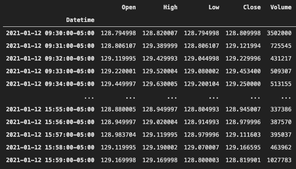
high = pd.DataFrame(data=data['High'], index=data.index)When you print out the data it should look something like this. We will be given the date and time, open, high, low, close, and volume.
How could we figure out the number of clusters that is best to split our data into?
As discussed earlier, we need to figure out the value of K. This also becomes more difficult as the dimension of the data increases. There are two popular methods to accomplish this- Elbow Method and the Silhouette Method. I will be doing it both ways to demonstrate and compare.
1. The Elbow Method:
In this method, we pick a range for the values of K, then apply K-Means clustering using each of the values of K. Find the average distance of each point in a cluster to its centroid, and represent it in a plot. After that we pick the optimum value of K using the plot.
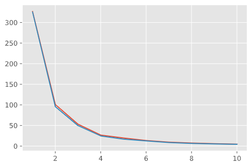
The picture shown below is the graph of the Inertia vs the K value. Inertia is defined as the mean squared distance between each instance and its closest centroid. In simpler terms, it is the graph of the mean distance of each point in the clusters from its centroids vs the number of clusters.
As you can see, the average distance decreases as the number of clusters increases. Increasing the value of K will decrease the inertia for your model. An inertia of 0 would mean each point is 0 distance to its cluster center. In order to find the optimum number of clusters we need to look at where the rate of change of the distance decreases suddenly.
Using the graph, we can conclude that 4 is an optimal value for K.
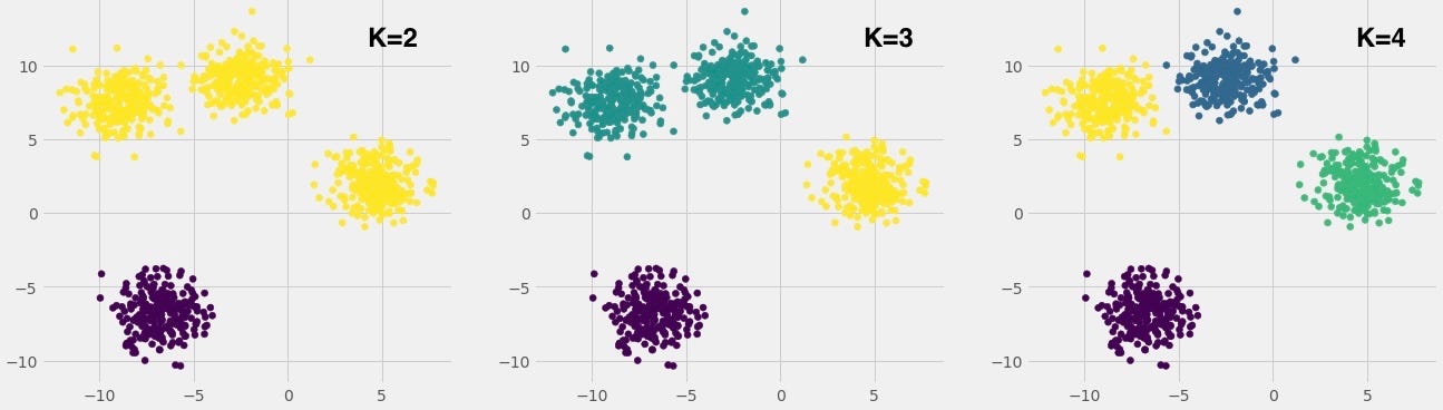
What we were basically doing is picking the value of K which will separate the clusters the best. We tried to test K=2,3,4. As you can see in this picture, K=4 fits the best.
# finding the optimum k through elbow method
def get_optimum_clusters(data, saturation_point=0.05):

    wcss = []
    k_models = []

    size = 11
    for i in range(1, size):
        kmeans = KMeans(n_clusters=i)
        kmeans.fit(data)
        wcss.append(kmeans.inertia_)
        k_models.append(kmeans)

    plt.plot(range(1,11), wcss)

    return k_models

# index 3 as 4 is the value of K (elbow point)
low_clusters = get_optimum_clusters(low)[3]
high_clusters = get_optimum_clusters(high)[3]

low_centers = low_clusters.cluster_centers_
high_centers = high_clusters.cluster_centers_

data['Close'].plot(figsize=(16,8), c='b')
for i in low_centers:
    plt.axhline(i, c='g', ls='--')
for i in high_centers:
    plt.axhline(i, c='r', ls='--')
2. The Silhouette Method
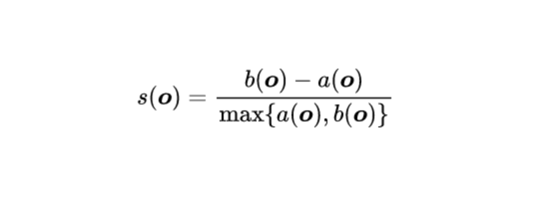
- s(o) is the silhouette coefficient of the data point o
- a(o) is the average distance between o and all the other data points in the cluster to which o belongs
- b(o) is the minimum average distance from 0 to all clusters to which o does not belong
The silhouette coefficient is a value between -1 and 1. Value of 1 means clusters are well apart from each other and clearly distinguished. 0 means clusters are indifferent, or the distance is not significant. -1 means clusters were not assigned properly.
The silhouette value measures how similar a point is to its own cluster (cohesion) compared to other clusters (separation).
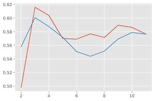
In order to get the silhouette score we average all the points out. After calculating it for each of the K values, we pick the value with the highest score. As you can see in the picture below, the silhouette score for K=3 was the highest for both the values of the high(red) and low(blue) stock prices.
Elbow vs Silhouette
After we received our K values using both methods, we use the center of each cluster as the support and resistances for our stock.
Since we came up with a K value of 3 using the Silhouette and 4 using the Elbow that will be the number of supports and resistances we will plot on our graphs.
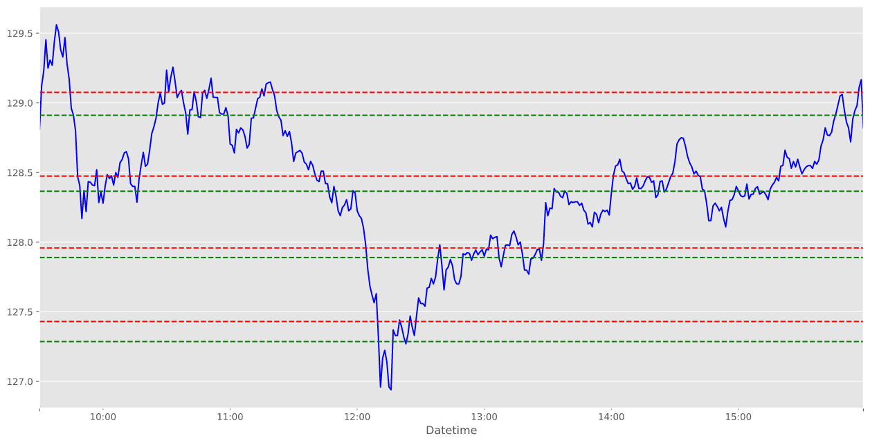
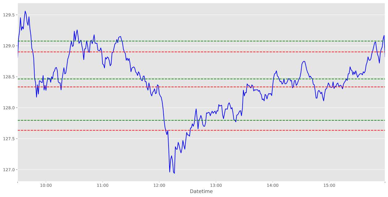
Although we got different results for both, by looking at the chart you could see how the Elbow method had better drawn supports and resistances. It is always best to use both methods just to make sure you select the most optimal number of clusters in K-means clustering.